Pages

Showing posts with label Color Theory. Show all posts

10.16.2015

4th Grade: Silhouettes and Oil Pastel

I have no idea what to call this project - but it is really amazing and cool.  I got the majority of this lesson from smART Class, and then tweaked parts.  The high contrast, and visually dynamic product was perfect for my fourth graders.

The first day students and I reviewed what they know about colors - which colors mix to make others, which ones work well together, which ones make brown... etc.  Then we passed out liquid watercolors (honestly, never going back to cake watercolors), and two coffee filters per student.  Students were in charge of folding their coffee filters in half, twice, getting a paint brush and painting them.  This seems easy and perhaps 'boring' but the kiddos LOVED it.  The coffee filters absorb and bleed the colors around and into each other - something paper normally won't do.  It was fascinating.  The first class I introduced this to, I also planned to have them cut out their black paper - but only two kids got that far, so for rest of the classes we just enjoyed the painting.

Pumpkin patch and skeletons coming out of graves!
The second day I introduced what we were going to do with these filters.  (I purposefully did not tell them when they were painting, because I didn't want them to over plan).  I stressed to them that they did not have to do Fall or Halloween - but anything: a normal day, Christmas, Easter, a pretend place.  Our goal, rather, was to use shapes and size to help communicate to our audience what was happening not to do just Halloween.

Knee-high by the Fourth of July
Next, students used a tracer to trace and cut out a hole on their paper.  Next, students unfolded their dry coffee filters and picked which one to use for their project.  (I had students make two so that if they hated one they had another choice, and if they made a mistake on their coffee filter that we couldn't solve they had a back up).  They taped their coffee filters on the back of their paper, flipped it over and went to work drawing with a Sharpie in silhouette style. Some students really struggled with the idea of silhouette and others nailed it.  I think, in the future, I will try and introduce silhouette more purposefully and see if that helps.

The simple added detail of a house number.
The third week we busted out the oil pastels and grew our picture out into the black.  I encouraged students to take what they had already draw and continue that into the black space.  We did part of one on the board together - they brainstormed a bunch of ideas for me and then I did a 'think aloud' where I said everything I was thinking, including mistakes and changing my mind about things.  I reminded and encouraged students to use their knowledge about perspective - things far away appear smaller and things closer appear larger.  I also showed them how wonderfully oil pastels layer and blend.  I encouraged them to use more than one color for each part of their picture - if you have pumpkins, do more than just one color of orange.  I would show them and they would all 'ooooh'  'ahhh - that looks so real'.  I then, turned them loose.  Many remembered about perspective and applied it, some still are struggling with the idea that sidewalks should appear larger at one end.

Christmas!
On the fourth and final day students finished up and we did a whole class review/critique.  I post all finished work on the board.  I then set a timer for 10-15 minutes, depending on how much work is complete.  I explain to the class that if they need all class to finish they can use all class - however in 15 minutes I will clean up everyone who is done and we will do a class review.  They may join us as soon as they are complete.  So, after fifteen minutes I ask everyone who is done to clean up, anyone who is not done should ignore clean up and continue to work.  I pull everyone to the carpet and I lead them through a series of open ended questions.  Sometimes I ask them to point, sometimes to raise their hand, sometimes to pair share, sometimes share to the whole class.  My goal is to get them to look more critically at their own work and be inspired by each other.  Some questions I tend to ask:
"Find yours on the board.  When you have found it, please point at it so I know you found it."
And the field goal is good!
"Put your hands down and look at your own work.  Find something you feel you did a good job on.  When you have something, raise your hand. (wait for all hands).  Please share quietly with someone next to you".
"Look at the projects and find one, that isn't yours, that captures your attention.  For some reason out of all of them you keep coming back to this particular one.  Raise your hand when you have one. (wait for hands).  Now look at it more closely, maybe compare it to others around it - what about it captures your attention?  Notice I didn't ask which one you liked - I asked which one captured your attention and why.  When you share please use your artist words to describe what captured your attention for example: Ava's really captured my attention because the texture of her grass makes it look like its blowing in the wind.  NOT: I like Ava's because it is pretty.  Share with your neighbor about which one captures your attention and why."
Snow angles and the Aurora Borealis.
"Anyone want to share out to the class about which one captures their attention and why?" -- As kids do this I do not agree or disagree with their picks - simply  "okay" and call on another.  This review is not about what I think.
"Point at one that you feel used color really effectively -- find another"
"Point at one that you feel is very unique."
"Point at one that you feel has strong craftsmanship"
"Find yours again.  Look for something that you would change or add.  Maybe you were inspired by another student's idea or use of material.  Tell your neighbor.  Does anyone want to share out what they would change?"


Those shadows and highlights!


11.14.2014

4th Grade Visiting Artist: BLVisuals

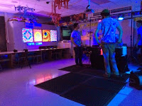
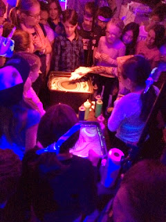
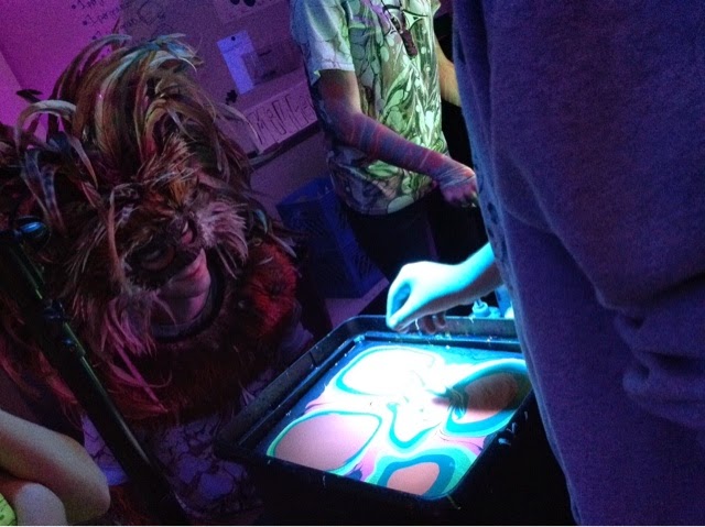
I can not come close to expressing in words the amount of joy, wonder, and excitement that filled my room yesterday afternoon.  BLVisuals let each student pick their own colors for a bandana - swirl them as desired and help dip, rinse and dry.


While students were waiting for their turn at dipping or simply trying to be patient while their creation dried - the group at BLVisuals brought along some fancy glasses that order colors in your depth of field.  Hot colors in the front (closer to you) and cold colors in the back (further from you) giving anything with hot and cold colors an element of 3-D!  It was amazing! Students loved looking at posters and their bandanas with the glasses.

Students were also excited and encouraged to take their tapestry/bandanas and hold them in front of color changing lights - which in turn, magically, changed the colors on their bandanas! 

Every year each of the arts teachers in my building are in charge of bringing in an artist from our field.  Our AMAZING PTO sponsors these visiting artists and their workshops for our kids.


Pretty sure my students would describe the visit as "Best Day Ever".


BLVisuals dips most anything fabric and frequently travels to festivals and dips patron's arms.  Their paint is a unique blend of acrylic paints - their beautiful creations on skin last about the length of a temporary tattoo while being permanent on fabric.

It was a truly awesome day.

11.20.2013

Rectangular Prisms (3-D Buildings) and Making Thinking Visible

Okay - so I have been thinking about updating this blog for weeks now - but I have been SO busy, that by the time I get home, I just don't have any energy to write a coherent blog message.  Which is kind of hilarious because it is currently 9:30 pm.  I was at school at 7:50 this morning and left tonight at 9:00...... one word:  conferences.

Anyhow, something amazing happened today in my room and I just need to share!

I have posted on here about my exploration into Making Thinking Visible - my struggles and ideas of how awesome it is.  Today I didn't do a thinking routine, but the thinking routines gave me the foundations for a discussion we had today in third grade.

Lets back up a minute:

Last week we reviewed 3-D shapes: sphere, pyramid, triangular prism, cone, cylinder, rectangular prism, and cube.  After we reviewed shapes I told them we were going to draw rectangular prisms - but from the corner and we were going to pretend that they were VERY tall so we couldn't see the top.  This means we would see the front corner, two flat sides, two far corners and the top edges but not the top itself.  (I got this idea for this project here).

I had the kids draw a bunch of arrows - varying in height and size.  Next we drew straight lines down from the tips of the arrows - if the line touched another arrow then it stopped.  Low and behold tall rectangular prisms.  We then decided to add windows and doors to our shapes to make them into buildings!

Back to the present:

So this week we are painting their buildings.  I first thought about making them use certain colors to help them with their color theory - but at the last minute I just let them paint.  We talked briefly about colors that work better together and having a high contrast between the buildings and the sky.  As students worked it seemed more that they just painted with colors they liked and didn't really plan ahead.

This was a little frustrating, but I also had told them to paint however they felt moved to paint, so I couldn't be too upset.  (The only rule I really put on them was that they needed to paint IN their picture and not over.)

So, TODAY is where it got really interesting!  Instead of telling the kids about contrast and how different colors work together - I wanted them to find it on their own.  This is where my new foundation in Making ThinkingVisible helped out!

I took three paintings from yesterday's class (a different class) and hung them on the board before my new group came in, making sure to cover the names. (I also waited till the class left to take them down).  I wanted to make sure students could participate without fear or worry about someone critiquing their work.

I started by asking the kids to pick their favorite one.  No voices, no comments - just look and decide which one they liked best.  Then I asked them 'What made you pick that one?".  This time when they had an answer I wanted them to raise their hand.  When most hands were in the air I asked them to share with an elbow partner.


Next I asked them "Which is your least favorite?" then "What makes you like it the least?"  - I had them share.

Then we went through each picture and students raised their hand if it was their favorite - I then called on a few kids to share why.  For the same picture I asked who liked that one the least.  I, again, asked for students to share what made them decide that.  It was great to hear that some students like number one because of all the colors, but others didn't like it because they found the colors to be too much.  We repeated this for the next two.

While we were doing this I learned A LOT!  Turns out third graders enjoy lots of color - almost the whole class picked the first one as their favorite.  Interesting enough students didn't like three as much because the sky was green and not 'real' (which is also why it was the favorite for some kids).  I then pointed out that number one doesn't have a real sky either.  Hmmmm.....

So as we were doing this I realize that the whole reason I was asking these questions was to see if they could notice which buildings were easier to see - but no one was headed that way.  Most of the kids liked the pictures based on colors or craftsmanship.  This in itself was interesting.  Sometimes I forget that kids are kids and have a different aesthetic on art than I do.  I look at the pictures and find the contrast to be more pleasing, even though I love lots of bright colors.  It was helpful for me to learn this information about my students to see that their color choices were indeed choices and not as haphazard as I originally thought.

I then asked them two more questions:

1) Which one has the best craftsmanship? What makes you say that?

2) Which one is it easiest to see the buildings on?  What makes you say that?

This got even MORE interesting.  Students were all over the place for craftsmanship.  Some decided having white spots made it have poor craftsmanship, while others based it on how much the paint bled into other colors.  Ahh the lens of a 3rd grader.

I was expecting students to pick their favorite cities for the one you could see the buildings best in - being that those they already had a bias to.  Interestingly enough almost every kid in the class picked number two as being able to see the buildings the easiest.

We then spent some time exploring why number two was easier to see -- they all had buildings, all windows, all had doors, and all had the same kind of sky.  Number two had less colors and was most like number three - but number three was still kind of hard to see the buildings.  Students started to talk about light colors and dark colors and how the orange was a lighter color and blue more medium or dark.... this is where I jumped in and we talked about having high CONTRAST.  Colors opposite on the color wheel have a higher contrast and stand out against each other.  Colors on the color wheel that are close to each other have a lower contrast, meaning the colors are more similar.  So the third picture has yellow buildings and a green sky -- yellow and green are close to each other and have a low contrast.  Blue and orange in number two have a high contrast because they are across from each other on the wheel.  The first one uses the same colors on the building as in the sky so it all blends together.

At this point we talked about actively choosing the colors they wanted for their desired outcome.  Did they want LOTS of colors all over, but see the buildings less?  Did they want to be able to see the buildings easier?  I even had a kid pipe up and say that you could use cold colors on the sky and hot on their buildings because they are different.  Totally!

The class today I think had a better idea of what contrast means and what it looks like - I have no idea what their papers will look like... they didn't have a tone of time to paint today.  It will be interesting to see if there are more high contrasted pictures or more color everywhere.

10.18.2013

Art and the MEAP (Michigan Educational Assessment Program)

Wow!  How has it been almost a month since I posted last?!  Time flies when you are having fun!

The last few weeks have been packed with craziness - I was sick for a bit, field trips, National Testing for the upper grade levels - it's honestly been kind of a mess.

I halted all 3rd, 4th and 5th grade projects for the last two cycles due to MEAP tests.  I realized that their brains were complete toast by the time they got to me and we needed to do some relaxing, other side of the brain thinking in art.  My goal was to not only rest the one side of their brain, but to re-energize and almost reset their day.

My fourth graders were finishing up their collages from their visiting artist and while this is a 'simple' enough task - it wasn't the kind of way I wanted them to use their brains.  Instead we worked on a value project where they needed to mix colors and paint - much more therapeutic. 

We started out by BRIEFLY looking at pictures of the moon at night.  (*Normally I would make the observation part longer, but it is not what the kids needed this week.  Also, the kids are observing the moon in science!  Who knew!).  We talked about what they saw - the colors, the sky... etc.  Next, I showed them how to use a safety compass.  (Honestly, best compasses EVER!).  They drew concentric circles.

At this point some classes were done for the day because I only saw them for 20 minutes - other classes got a chance to get to the paint.  I set out trays with white, black, blue, and purple.  The students painted their moon white, the first ring was their sky color with white, then after that they added a little bit of black for each circle till it got darker and darker and darker.

Students went from loud and squirrel-y to mellow and focused.  I asked the group how their brains felt - many replied with a sigh and a 'much better'.

This lead me to realize that I could help out the grade level teachers as well as the kids.  I sent out an e-mail to the teachers suggesting that they do a little bit of art after their testing.  It wouldn't need to be much 10-20 minutes and it could be as easy as coloring a geometric coloring page.  The rhythm of coloring/painting helps to calm and refocus the brain.  I know that in college during finals I would put out a stack of coloring books and all my crayons in the common area.  Almost everyday I would find the majority of my suit mates bent over coloring books after long bouts of studying or tests.  They would exclaim how much better and more relaxed they felt.

After I sent out my e-mail offering to print some coloring pages - one of the 4th grade teachers e-mailed me back.  She said that their writing assignment that day had to do with some characterization and instead of jumping right into the writing she had them spend some time drawing their character - she said the lesson went smoothly and the students produced a lot of information about their characters!

---------

My third graders have been hard at work exploring landscapes (horizon lines, foreground, middle ground, back ground... etc).  So, again, I decided that wasn't quite the way I wanted to exercise their brains after a morning of MEAP testing.  So, we took a break and did chalk leaf piles.  I have done this lesson for quite a few years now - and they always turn out beautiful.  The students fold a piece of card stock in half, draw half a leaf, cut out the leaf in one long cut!  They should have two stencils - a positive and a negative.  (Sometimes it takes kids a few tries to get it.)  Next they charge their stencil with leaf colored chalk, place the stencil on their paper, smear the chalk from the stencil to their paper.  The students repeat this process with both stencils and then with each others stencils until their paper is filled - overlapped leaves and leaves that go off the edge.


Again, students start out loud and a little over the top - by the time they start using chalk the energy and noise level evens out.


--------
5th grade was a little bit different.  They were finishing some 2-point perspective words and then starting their t-shirt designs for 5th grade production.  So, while I didn't restructure their lessons like the other two grades - their assignments already focused on using their brain more creatively.


11.28.2012

5th Grade - Sphere Sculptures (Decorative Paper)

Pinterest strikes again!  I saw these:
http://myplumpudding.blogspot.com/2009/04/cereal-box-globes-for-earth-day.html


I wasn't exactly sure how these were going to get woven into my curriculum this year - but I was sure they would fit somewhere.  I decided these would fit with 3D, values, hues, personal choices, recycling/upcycling - and so much more!

So, the students haven't actually made these yet - today I had them decorate cardboard that has about the same thickness as cereal boxes.  The wonderful ladies in the lunch room collect the cardboard for me from boxes of fruit!  I have HUGE stacks of the stuff and I always get excited when I have a way to use large quantities of it.  I love that it is easy to cut, but yet holds up pretty well to copious amounts of tempra paint.


Today, I had students decorate the cardboard in an Eric Carle type style.  They started with a base color, chose another color to add a design, then add another color and yet another design - then students could leave it or use a decorative comb to add designs by scraping paint around in a pattern.  I told students that I would pick the colors for their tables - but not to worry they will get to pick papers from ALL the tables when it comes time to make their spheres.  I explained that I pick their colors because it gives us more usable colors - if I just let them go, we would get a BUNCH of brown and blue.  I generally give each table their table color in paint - so blue table got blue paint, red table got red paint (keeps down the arguing and whining).  Each table got a variety of tints/shades of their color to make these stand out, for example green table got:  green, bright green (green + yellow), mixed green (yellow + blue), and a thing of white (ends up being light green).

At first students were being very careful and clean about this process - which I some what appreciated, but we needed papers that were free, open, full of motion and color - students needed to be a little more - organized chaos.  I told many of them they were being too nice and needed to give a little more 'umpf' to it.  Soon it was a controlled whirl wind!  Paint, cardboard, brushes, students were everywhere - in a good way.  I was busy filling paint as it ran out while keeping the cardboard stack well supplied.  It was awesome.

I had MANY students today exclaim, "This is the best day of art EVER!"  There is something beautiful, freeing even of letting loose - not 'making' anything in particular.  We weren't making dogs, cats, perspective drawings -- students got to just create.  It was BEAUTIFUL.

It is going to take me some time to cut all these papers for students to make their spheres - but they will be amazing - I am SUPER excited.


1.17.2012

Black Book of Colors - 3rd Grade


I did a "Black Book of Colors" lesson a few years ago, and decided that my current group of 3rd graders could handle the whole concept/idea.

I started out the first day of the unit with the question, "Can people who are blind understand color?".  I had the students vote, with their heads down, to see what they thought.  In MOST of my classes it was an overwhelming thought that no a blind person couldn't understand understand colors.  A couple of students always said yes.  I then asked for volunteers to explain their thoughts.  As expected the kids that say no can't wrap their heads around how to explain a color without sight and the kids who think yes - say you just have to explain it enough.

As this point I change the question to "Can a person who is deaf able to understand music?"  Immediately I have students saying yes!  I ask how.  They immediately tell me that the person could watch people play instruments, or someone could sign the words, or read music.  At this point they are so close to opening up their way of thinking that you can feel it in the room.  Next, I ask how many of them have sat at a red light and they can feel the bass of a car 3 places back?!  Almost all of them raise their hand -- I ask them how they could hear a car so far away..... tick... tick.. HANDS SHOOT IN THE AIR.  There are gasps as students get it.  I call on someone and they say they could feel it.  So I summarize - if people who are deaf can understand music through sight and sound - how could someone who is blind understand colors?!

Slowly, so slowly the gears are turning as students start to transfer their new thoughts - and BAM.  Hands go up.

Now, instead of calling on someone I tell them we are going to do an experiment.   I explain that I am going to blindfold a volunteer, hand them an object and their job is to tell the class what color it is.

I am always surprised on how many students volunteer for this role.  I pick my first volunteer and blindfold them.  I stress that if they cheat by looking under the blindfold it won't really help our experiment.  I then stress to the class that they can't make a single comment because even if they don't mean anything by it, it might give the color away!

I hand my first blindfolded student an orange making sure I puncture the skin with my nail.  After a few seconds the student tells me it's an orange.  I of course then ask what is the color?!  The student generally giggles and says, 'orange'.  I ask the class if this is true and they say YES!

I repeat this with a variety of things: a piece of chocolate (making sure my volunteer has no food allergies), a banana, the sunlight, a smelly marker, a cup of water.

After this is over we re-vote on the original questions "Can people who are blind understand color?".  Most students switch over to 'yes' though there are always still a couple of 'no'.  Now, I explain to them that they are both right.  People who are blind can understand color through their other sense though we don't know if they understand it the same way we do.  (I don't normally like to have 'trick' questions but this time it seemed appropriate).

I then read the best book ever, the book that inspired the unit - "The Black Book of Colors".  This book is written from Thomas's point of view.  He describes different colors using his senses: taste, smell, feel,  and even sound.  The pages are black, type in white - the book is also complete with brail and the pictures are all meant to be touched as they are raised off the paper.  The pictures have no color.

Next, I explain that we are going to make our own black book of colors.  (Pause for excitement and whispers).  As a class we complete the paper I am about to hand out to them.  It is a simple paper, but the thoughts the students have to create are new and stretch their current ways of thinking.  I have found that this paper helps them organize their thoughts.

Their paper says:
COLOR:

SMELLS LIKE:
TASTES LIKE:
SOUNDS LIKE:
FEELS LIKE:

So to complete this together I have a student volunteer a color, then other students to volunteer a way to use smell, taste, sound, or feel.

Example:
COLOR: green

SMELLS LIKE: sweet spring.
TASTES LIKE: mushy, gross, peas.
SOUNDS LIKE: summer breezes through the trees.
FEELS LIKE: sharp, pokey grass

After we create the example I pass out the papers and they make up their own colors and examples.  I stress that each one should be different, because otherwise they pick the first one they come up with and describe it for rest of the paper.  I remind them they are describing a color and not 'grass'.  This is a little tough for some students and they need some extra examples.  When they answer these they draw a  SIMPLE thumbnail sketch for each one.

DAY 2:

Students finish their white brainstorming sheets, pick their favorite drawing and draw it BIG on 9x12 black construction paper.  Next, they trace their lines with good ol' school glue.  We talk a lot about making their lines too skinny or too thick -- getting them just right.  I tell them to hold the bottle like a pencil with one hand, tilt the point, put the point on the paper, and always PULL the glue bottle -- turn the paper if needed.

When their picture is on the drying rack they are to write what they drew in a FULL COMPLETE sentence on their white paper... "Green tastes like mushy, gross peas".

DAY 3:

I tell students that we are going to test their papers.  I pass out random pictures FACEDOWN to students.  I ask them to keep their eyes closed, flip over the papers and try and figure out the picture using their fingers.  When they think they know they are to raise their hands.  When most students raise their hands I have them look to see if they were right - flip them back over, shuffle the papers in the middle of their table and pick a new one!  I did this for about 3-4 rounds.

Next, students take WHITE colored pencils and write their sentence somewhere that makes sense on their paper and in a size of lettering that also makes sense.

I then had them pick out a piece of colored construction paper that goes with the color they chose to represent.

10.04.2011

"The Dot" by Peter Reynolds - Kindergarten Primary Color Theory


I love kinder art - there is something about their freedom of lines, not planning their marks, even down to how they write their names.  They don't have a 'ground' yet, no real understanding of 'correct' direction - love them.

If you have never read 'The Dot" by Peter Reynolds - read it and see how these were inspired.

The students drew 10 dots, signed their paper like Vashti in the book, then used only primary colors to make more dots!  Sure enough about 5 minutes into it I hear kids saying how they got green, orange, purple and sharing with their friends how to make those colors!


4.26.2011

2nd Grade - Tints/Shades cylindrical Cakes

This is one of my favorite 2nd grade projects.  I was inspired by another teacher in my district that does this project - though I have modified it a little over the last couple of years.

I start out by showing the students a slide show of layered cakes from Charm City Cakes.  The students 'ooooo' 'awwww' 'COOL!' and so forth.  I like to emphasize that this is a real job - that Chef Duff and his friends get paid lots of money to decorate cakes!  They even have their own tv show.

After the slide show is over, I freeze the slide show on one cake and I explain that they will be creating their own cake on paper.  They will get to decide how many layers, how the cake is decorated, and next time they will get to use paint to finish the decorations!  Often times, at this point students are very excited.  I then explain that even though their cakes will be on paper they will need to look 3-D.  We quickly discuss that we know in real life the cakes are round - but on paper they are flat with the illusion of being round.

At this point I explain that we will learn to draw a cake in 3-D.  I use the cake being projected on the white board, from the slide show, and ask the students what the very top shape is and to raise their hand.  I wait a few seconds and tell them to look carefully and not to be tricked - what shape is on the top.  I wait until most of the class has their hand up and then call on someone.  Sometimes I get a circle and sometimes I get oval.  I don't give them the answer - but instead I trace the top shape.  I ask the students to agree or disagree that I have indeed traced the shape - they agree.  I then cover the projector and ask what shape it is - They say 'oval'.  I then explain that their brain KNOWS that cake is circle - but when viewed at a certain view point that circle LOOKS oval.

I then proceed to trace rest of the cake pointing out key features that make the cake look 3-D, like: There are not corners on it, all the corners are rounded.  The next oval starts up on the edges of the layer above not on the bottom corner. 

After the students have helped me trace the cake I turn off the projector and do one more freehand on the white board having the students tell me what to do.  When the cake is drawn I explain they need to decorate their cake with BIG designs.  Students like to draw small detailed pictures on their cakes and it ends up being too hard to paint, so I emphasize BIG designs.

The next class I introduce tints and shades to the students.  I give them a hint to remember tint and shade -- that when you stand in the SHADE of a tree is it lighter or darker there?!  They reply with darker - that way they can remember that a shade is mixing black with a color and a tint is mixing white with a color.  We also do a quick review of the color wheel and how to use it to get the color you want.

Next,  I pull the students around a table and proceed to show them how I want them to mix colors.  I only give them RED, YELLOW, BLUE, WHITE, and BLACK.  I explain that there are three simple guidelines for mixing paint.  1) No mixing colors in the paint dishes.  2) The mixed color can not be bigger than your hand (if it gets out of control they clean up the paint and use crayons - way not fun) 3) All colors must be a tint or a shade.  I then proceed to mix colors by the input of students.  One student will suggest a color, another will tell me how to make it, and a third student will tell me to make it a tint or a shade.  I have the students scoop a little of the paint they want from the paint dish and put it on the table, wash the brush, and scoop the second color and mix.  I have found that mixing paint this way keeps students from mixing too much of a color.  In three years of mixing paint this way I have only had two students clean up their paint and use crayons.

This project takes 2-3 classes to paint depending on the skill, determination, and craftsmanship of the students.  In the past I have had the students cut out their cakes and mount them on construction paper.


The students really love this project and the cakes are always very interesting and unique.